What your logo says about your business (More than you think)
By Destanza Creative Studio | Strategic Branding · Montréal
Before you say a word. Before a potential client reads a single line on your website. Before they even glance at your pricing — they've already formed an opinion about you. Your logo did the talking.
For many entrepreneurs and beauty professionals, this is an uncomfortable truth: your visual brand is doing silent, constant, largely unconscious work. It attracts. It reassures. Or it quietly turns people away.
In this article, we break down what your logo is really communicating to your ideal clients — and why the importance of a logo for your business goes far beyond aesthetics.
Your Logo Is Your Silent First Impression
There's an unwritten rule in business: people buy with their eyes before they buy with their minds.
Research from the University of Winnipeg found that consumers form a judgment about a brand in less than 90 milliseconds after seeing its visual identity. Not a minute. Not ten seconds. Less than a second.
In Under 3 Seconds, Your Clients Have Already Decided
In that fraction of a moment, your potential client's brain is quietly answering three questions :
Is this business professional, or does it look amateur?
Is this brand meant for someone like me?
Can I trust this person with my money, my health, my appearance?
A polished, cohesive, intentional logo answers "yes" to all three — without you having to say a single word. A neglected logo plants doubt that even your best sales pitch will struggle to overcome.
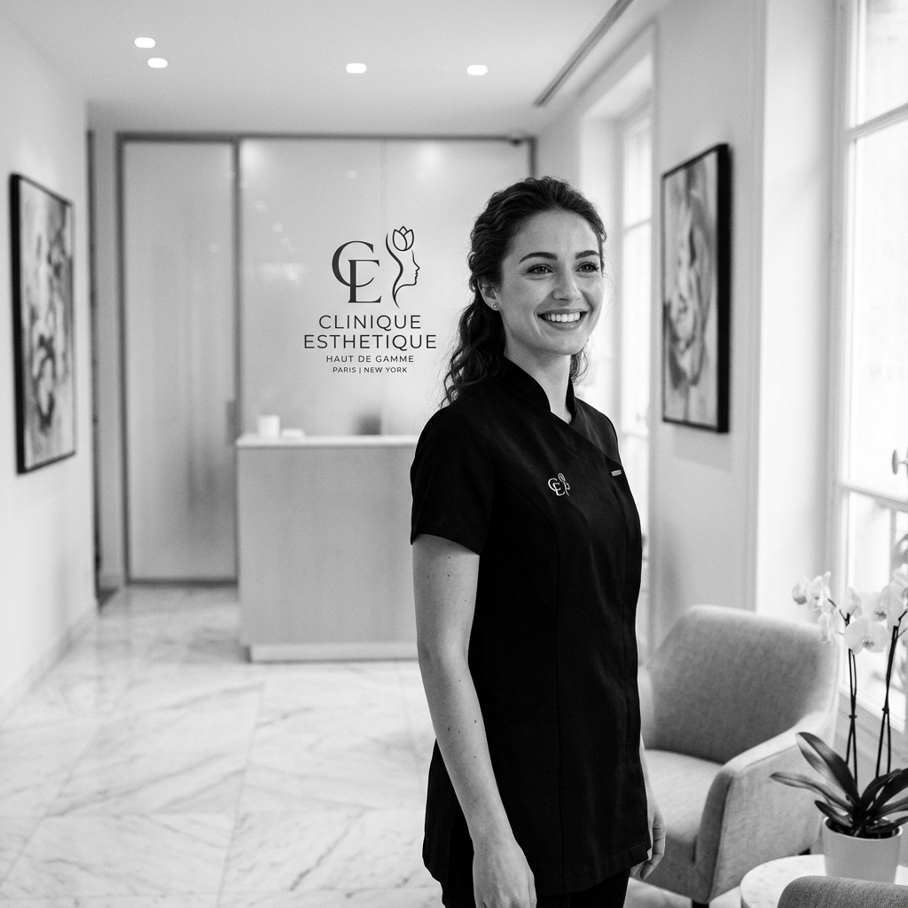
For beauty clinics, medical aesthetics professionals, and wellness practitioners, this dynamic is even more critical. Your clients are trusting you with their bodies, their confidence, and how they feel in their own skin. They need to sense precision and care from the very first visual impression.
The Psychology of Logo Design — Every Choice Sends a Message
A logo isn't just a drawing. It's a visual communication system where every decision — colour, shape, typography — carries meaning. Understanding logo psychology means understanding why some brands instantly inspire trust while others don't.
Colour : Your First Emotional Signal
Colour is the most immediately perceived element of your visual identity. It triggers an emotional reaction before the eye has even processed the shape.
White and soft neutral tones evoke purity, cleanliness, and precision. It's no coincidence that premium medical and aesthetic clinics lean heavily on these palettes — they calm, they clarify, and they signal expertise.
Gold, champagne, and warm taupe communicate luxury, rarity, and premium value. A brand using these tones tells its client: we don't do discount.
Deep black conveys authority, elegance, and sophistication — the choice of brands that want to be perceived as essential and non-negotiable.
Soft blush pinks and mauves suggest femininity, gentleness, and care — a natural language for beauty and wellness services.
Choosing your brand colours without strategy is like choosing your words at random during an important client meeting.
Typography : Modern, Classic, or Somewhere In Between?
Your typeface says a great deal about your positioning.
Serif fonts (with the small flourishes at the letter ends — think Playfair Display, Garamond) evoke tradition, heritage, and depth. They suit brands that want to project substance and long-standing legitimacy.
Sans-serif fonts (Helvetica, Futura, Montserrat) project modernity, clarity, and directness — the go-to for brands that want to feel contemporary and accessible.
Script or calligraphic fonts bring human warmth and a handcrafted quality — but used carelessly, they can also signal amateurism rather than artistry.
The most common and costly mistake? Mixing fonts without a clear visual logic. It creates a dissonance that unconsciously erodes trust.
Shape : What Your Geometry Reveals
Even the geometry of your logo communicates.
Circular and oval forms evoke unity, softness, and trust. They invite, they include, they reassure.
Sharp angles and precise geometry project energy, dynamism, and modernity — signalling ambition and technical precision.
Organic and fluid shapes suggest nature, creativity, and authenticity — often used in premium wellness and artisan brands.
When an aesthetic clinic uses a logo with aggressive angles and clashing colours, it sends a message that directly contradicts what its patients are looking for: gentleness, safety, and expert care.

What a Poorly Designed Logo Actually Costs You
This isn't about personal taste. It's about money — and about clients lost before you ever got the chance to speak with them.
Beauty & Aesthetics Clinics: How Premium Clients Filter You Out
Premium clientele — those willing to invest in quality, who stay loyal, and who refer others — have a highly developed visual filter. They're accustomed to interacting with thoughtfully designed brands. They immediately sense the difference between a visual identity built with intention and a logo thrown together with a free online tool.
A premium service positioned behind an amateur logo creates cognitive dissonance. Your message says: we offer excellence. Your image says: we don't invest in the details. In the client's mind, the image wins every time.
The result ? Your ideal clients move on. And you're left attracting price-sensitive customers who negotiate — because your image isn't justifying the value you actually deliver.
The 3 Visual Signals That Make Ideal Clients Doubt You
These three mistakes are especially costly in terms of perception:
1. Inconsistency — A logo that doesn't match the rest of your visual world: your website, your Instagram feed, your business cards. Inconsistency signals disorganisation and lack of attention to detail.
2. Genericness — A logo that could belong to any business in your field. If it looks like your top five competitors, it doesn't differentiate you — it buries you.
3. Outdatedness — A visual identity that hasn't evolved can signal stagnation, a disconnect from current market standards, and a lack of investment in growth.
What a Premium Logo Actually Does for Your Business
A well-designed, strategically built logo doesn't just "look good." It works for you, 24 hours a day.
Attract Without Saying a Word, Charge More, Build Loyalty Faster
It naturally filters your ideal clientele. When your visual identity aligns with your positioning, the right clients recognise you instinctively. You attract those who match your offer and your value — and you stop spending energy convincing the wrong ones.
It justifies your pricing. There's a hard truth in business: clients partly pay for what they see. A premium brand gives them permission to invest more. Your logo directly contributes to your ability to charge what your expertise is worth.
It creates memorability. The brands we remember are the ones we recognise in an instant. A strong, distinctive visual identity engraves your name in the memory of prospects — even those who aren't ready to buy yet.
It builds trust before the first contact. In a digital landscape where clients discover you on Instagram, Google, or your website first, your logo is often the very first handshake. It needs to be firm, warm, and memorable.

Is Your Logo Working For You or Against You?
You don't need to be a designer to evaluate the effectiveness of your visual identity. Here's a quick five-point checklist.
Checklist : Is Your Logo Actually Working?
✦ The Consistency Test: Place your logo alongside your website, your Instagram profile, and your business stationery. Do they all speak the same visual language — same colours, same energy, same world?
✦ The Distinctiveness Test: Look at the logos of your five main competitors. Does yours stand out clearly, or does it blend into the crowd?
✦ The Legibility Test: Does your logo work at small sizes (Instagram profile photo, website favicon) just as well as at large? A strong logo reads clearly at every scale.
✦ The Audience Test: Show your logo to someone who represents your ideal client — with no context. What words do they use to describe it spontaneously? Do those words match the image you want to project?
✦ The Pride Test: When you share your business card or your Instagram link, do you feel proud — or do you feel a slight hesitation? That instinct matters.
If you hesitated on more than one point, it's a clear signal that your visual identity deserves strategic attention.
Your Logo Is Either an Asset or a Liability — There Is No In Between
The importance of a logo for your business is not a matter of ego or perfectionism. It's a matter of results.
Every client who visits your website, discovers your Instagram, or receives your business card makes a decision — often unconscious — based on what they see. A strategic logo turns that moment into an opportunity. A neglected one turns it into a missed connection.
Whether you're an entrepreneur just getting started, a growing aesthetic clinic, or an established business ready to move upmarket, your visual identity is one of the highest-return investments you can make in your brand and your bottom line.
Ready for a Logo That Truly Works for You?
At Destanza Creative Studio, we create strategic visual identities for ambitious entrepreneurs, beauty clinics, and brands that refuse to be ordinary.
Our process doesn't start with Illustrator. It starts with a deep understanding of your vision, your ideal client, and the positioning you deserve.
→ Book your free strategy call and discover how to transform your brand image into a growth engine.
Destanza Creative Studio — Strategic Branding · Web Design · Premium Content Creation · Montréal, Québec
Also read : The 3 Branding mistakes that are quietly repelling your ideal clients