
10 Must-Haves of a Med Spa Website That Actually Converts
A med spa website that converts — meaning it turns visitors into booked appointments — rests on ten specific elements: visible booking, human faces, clear pricing, proof, and a flawless mobile experience. The good news: none of the ten is complicated. The less good news: most clinic websites neglect at least half of them.
After auditing and designing sites across the medical-aesthetics space, here's the checklist we run through systematically — use it to grade your own.
The 10 must-haves
A "Book now" button visible without scrolling. On mobile and desktop, on arrival. Every extra click to find the booking costs you patients — most of whom book in the evening, outside business hours.
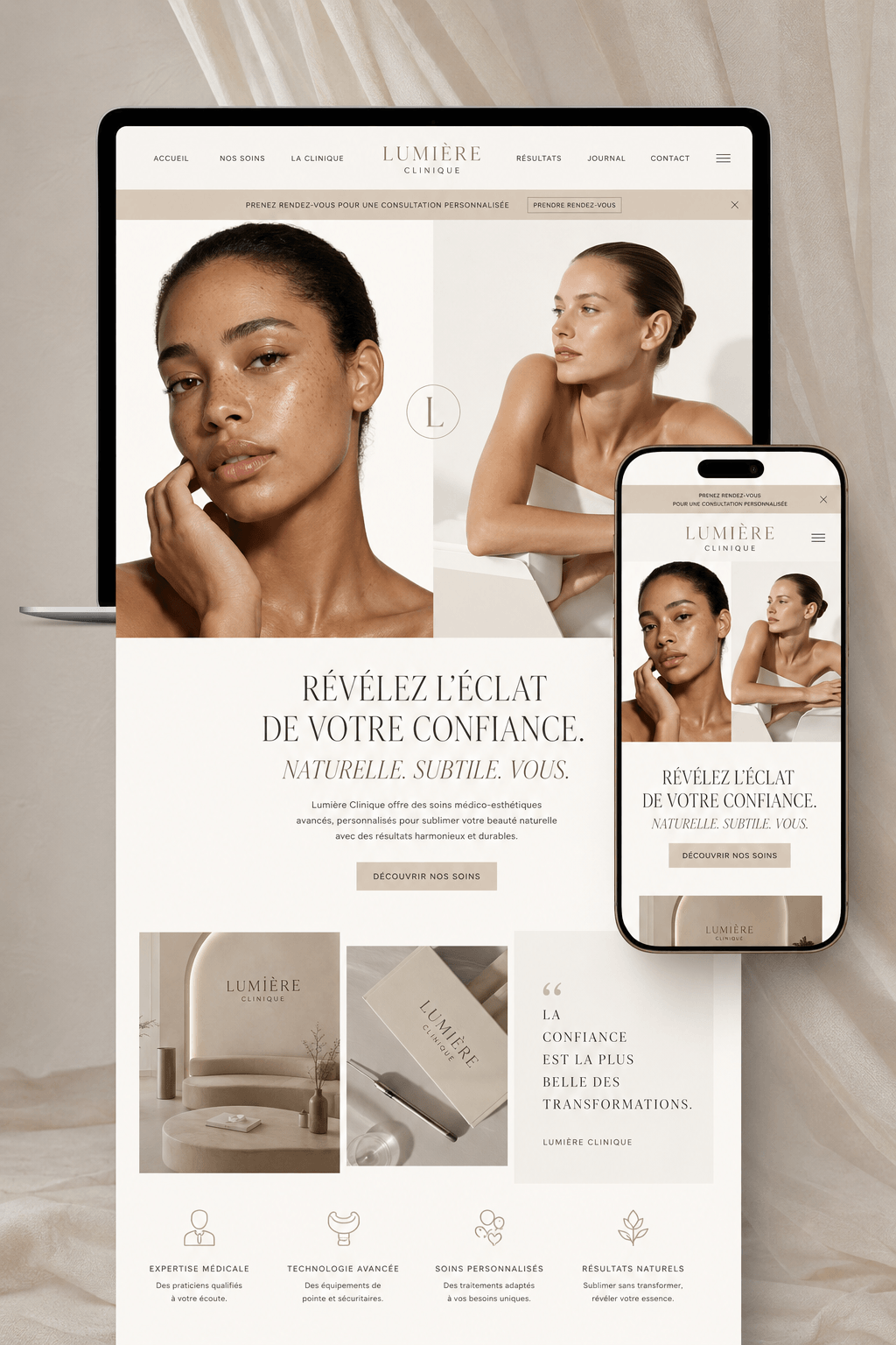
Faces, not just rooms. In aesthetics, the patient chooses a person before an address. Your team, professionally photographed, on the homepage and About page — the trust rate changes immediately.
One page per treatment, with price ranges. "Contact us for pricing" drives today's patients away. Clear ranges filter the curious, reassure the serious — and every treatment page becomes another Google entry point.
Before/afters presented with rigour. Same light, same angle, written consent. Your most powerful argument — as long as it radiates honesty.
Your Google reviews embedded on the site. The stars a patient saw on Google should follow her onto your site. A live review module outperforms any promotional copy.
An FAQ that answers real fears. "Does it hurt?", "How long does it last?", "What if I don't like the result?" Answering hesitations is how you convert the hesitant — and it feeds your SEO.
A fast site on mobile. Over 70% of your visitors arrive on a phone, often from Instagram. Three extra seconds of loading and they're gone. Test on cellular data, not office wifi.
Local SEO basics. Your city in page titles ("med spa in [city]"), a complete linked Google Business Profile, a visible address. That's what makes you exist when someone searches nearby.
Photos of YOUR space. Stock images are spotted instantly and say "we have nothing to show." A professional shoot is the highest-return investment on your entire site.
One single call to action. Book. Not five competing buttons (newsletter, Facebook, form, phone, email). The whole site converges on the appointment — everything else is secondary.
How to use this checklist
Open your site on your phone and walk the ten points as a patient who doesn't know you. Every "no" is a leak in your funnel: traffic you pay for — in ads, content, time — leaving without booking. Fix points 1, 3 and 7 first: they're the three biggest leaks in most sites we audit.
Frequently asked questions
My site has some of these. Where do I start?
Booking and mobile. An average site with flawless booking converts better than a beautiful site where appointments are hard to find.
Do I really have to show prices?
Ranges, yes. They position your level, eliminate price-shopping calls, and reassure — hidden pricing now reads as a red flag.
What does upgrading an existing site cost?
With a healthy foundation, a few hundred to $2,000 often suffices. If the site is 5+ years old or not mobile-first, a redesign is usually the better investment — see our med spa website cost guide.
The bottom line
Ten elements, one goal : the visitor arriving from Instagram, Google or word of mouth should find, within thirty seconds, everything she needs to think "this is the place, and it's easy." Your site doesn't need to be spectacular, it needs to be reassuring and frictionless.
Want to know how many boxes your site ticks ? That's exactly what our free 15-minute express audit covers.